


An app that accepts tokens of appreciation in exchange for rides
136
15
22
200
Wireframes
created
Iterations
made
People participated
in research
Hours
in project
WHY
Toronto is a city of 4.2 million people where about 70% of commuters travel in single occupant vehicles, less than 12% carpool, people spend about 6.5% of their monthly income on transit cards and over 1:30hrs are spent for commuting within a 10 km distance.
Also, wanted to find a win-win situation where people could share more time with each other and increase community engagement.

PROBLEM STATEMENT
Ideal
The city is connected through many subway lines, waiting time is 5min between trains and the cost of riding it is lower than 5% of their monthly income.
Reality
The subway has only 4 lines, all other connections are by streetcars or buses which increases commuting time.
Cost of commuting is higher if riders have to travel by public transit to a different city
Community engagement is low
Consequences
Commuting time is high and traffic is increasing
If riding on public transit, the cost is cheaper but the commute time is higher,
If riding on a vehicle, the cost is higher but the commute time is faster.
Low community engagement causes that most drivers ride in single occupant vehicles.
Less than 12% of people use a carpool to commute
Proposal
An app that connects drivers and riders going in the same direction and as a method of payment they share car expenses or provide goods.
At least 30% of drivers share their rides with others as they have high community engagement and like to help each, which saves time and reduces costs.
TARGET AUDIENCE
Daily commuters from 18 to 50 years old who travel from one city to another frequently and are interested in engaging with their communities and A) reducing their commuting time and cost, or B) helping other people getting faster to their destinations
THE PROCESS
Discovery
First, created a project brief which helped me with guidance throughout the project by keeping in mind the project's goals and users pain points.
Second, did an online research on commuting and a competitive analysis to identify the commuting options people could choose from, their pros and cons and areas of opportunities for the new app. The analysis was based on cost, time to destination, delays, equipment & services and experience. For this analysis, I took into consideration the public transit, car rentals, car-sharing companies, on-demand transportation and taxis.
Third, interviewed 10 people and passed a survey to 12 people, the findings were that over 80% people would carpool if the service was safe to use, 60% of users pay for a pricey method of transportation in order to get faster to their destination and 83% of the individuals use an alternate transportation to public transit several times in a month
Define

Personas: was easier to detect commuters pain points by using personas who are frustrated by costly or long commute, or tired for walking home with groceries, or disturbed by frequent delays
Competitive analysis: although the cost of transport independence is high, the time to get to a destination using a cheaper method could be 3x longer. Also, Users who rent a car are dependent on car availability and business hours
Job stories: helped to understand areas of opportunities for the app (i.e.: drivers could benefit from carpool since they could A) use the fast lane on the road, B) reduce the cost of gas)
Idea
Taking into consideration that 1) community engagement can be increased, 2) most drivers who travel in a single occupant vehicle could benefit from another passenger, and 3) people want to arrive at their destinations faster on a fair fare. I decided to design an app for commuters to connect passengers and drivers going in the same direction where both parties receive a benefit from the ride (passenger: a faster and fair commute, and, driver: reduces costs)


Branding
The name is inspired on the word Symbiosis, Symb is the interaction between two or more people that are in close proximity and going on the same route, where both obtain a benefit.
Colours used
Primary - blue, for is an accessible colour and is associated with trust
Secondary - orange, green and white for their contrast with the primary colour and sense of adventure
Design
The end result for the process was
landing page
sign up
set
a trip
search for users
carpool completed
When the navigation was complete, story flows were implemented (pink lines) by highlighting the path for each job story. This was done to ensure that every story had a clear navigation and nothing was missed.
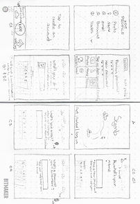
The first ideas for the app were created as paper & pencil sketches, Mid and High-fidelity wireframes were done in Sketch and to interact with user's locations used Google maps, as is a tool people are familiar with.


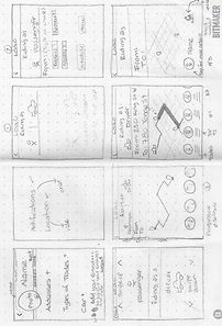
Sketches
Mid-fi wireframes


Hi-fi wireframes
Prototype (InVision)

For the final decisions decided to create A/B and Usability tests, which were passed to potential users, and then iterated on their feedback to obtain the best scenario for the app.
A/B Test
The caption test was done on hi-fi mockups since I found important to have the aesthetics in place before conducting it, to provide a realistic sense of the screen and truly determine what would be the best approach to have.
The test consisted of a control screen and 2 variations. The control had a small text below the input field, variation 1 had a bigger text above the input field and variation 2 didn't have text at all. 18 people took the test. The end result was a 67%preference on the control.


Usability Test
In this test, users had to input their phone number. The screen had an input field with numbers in light grey (indicating where and how to write the numbers) and the keyboard was open on the screen.
To pass the test, the user had to tap any number from the keyboard right away. 3 users out of 5 failed the test. Users said that because the field had numbers, their first option was to tap the input field to "activate it".
As a result, the grey numbers were eliminated to provide an active impression from the beginning
As a stretch goal, worked with a developer who helped me to develop an Alpha version of the app.


PEOPLE IN THE PROJECT
My role
Symb was a bootcamp's final project, and as the sole designer I conducted research (interviews, surveys and competitive analysis), analyzed the findings, worked on branding, created personas, job stories and worked on the app's navigation; then moved forward to sketches, wireframes a finally prototyping.
Working as a sole designer has its challenges, and so, being part of Slack channels where other designers offer their insights can be of great help.
CHALLENGES
• Two days before the final presentation of the app, the developer called me to say I had some screens that were not feasible and needed to be redesigned, with limited time, I created some sketches which the developer used as a guide while I worked on the wireframes and sent the assets
• Some UI components alone looked good but when combined as part the hi-fi wireframe the result wasn't pretty. Could be that the colour, shape or size wasn't right, or just that in a close proximity to other features they didn't look as nice as thought. That meant I had to spend more time than intended on adjustments.
TAKEAWAYS
• Was interesting seeing how users are sceptical of new ideas but are easily convinced when they can relate to a similar situation they haven't thought about.
• Conducting tests with an app's prototype can be useful to prove that the product is easy to use, and to iterate any flaws before the application is sent to developers.